When the COVID-19 pandemic began in early 2020, we started tracking the number of confirmed infections and associated deaths. Our goal was to develop a data-driven approach to analyzing the pandemic – one that would help us cut through the noise and fear surrounding this black swan. As of mid-April, global testing practices are still lagging in scope and breadth, and the fatalities data is also far from perfect. The world must overcome both of these obstacles to get ahead of the pandemic’s curve. However, we believe that it’s possible to leverage this data as a leading indicator to get a sense of when the virus may be peaking and then, hopefully, subsiding.
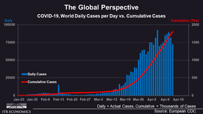
We’ve found that tracking total infections helps us get a sense of how developments associated with the virus are unfolding. As you can see in the chart below, which shows the daily and cumulative infections around the world, we had a potential peak in the daily cases (blue bars) on April 5. It does not yet confirm that a higher daily total won’t happen, but it is a promising sign. It’s also quite evident that the cumulative cases (red line) are still rising sharply, indicating that we’re not out of the woods yet.

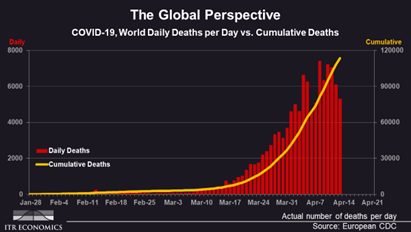
We’ve also been tracking the number of deaths in a similar manner. A parallel picture has emerged in this data as well – for the past five days, worldwide deaths (daily – red bars) have been lower than the potential peak number witnessed April 8. While this is also encouraging, the ongoing rise in cumulative deaths (yellow line) continues steadily, with no sign of flattening just yet.

We will continue to monitor both datasets for signs of improvement. We're eagerly awaiting the days when the cumulative infections data starts flattening, as that will signal an end to deaths as well. In the meantime, please stay tuned to our updates, as we are here to help you cut through the fear of these uncertain times and make good business decisions based not on emotion, but on quality data.